
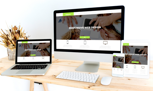
With consumers using both desktop computers and mobile devices such as tablets and cell phones, the buzzword in website development these days is responsive website design. In a nutshell, the ideal website has to be user-friendly regardless of whether it’s viewed from a computer, tablet, or phone. Images and videos have to load fast, while content and photos have to be viewed optimally with very little need for resizing or scrolling.
Why is it essential that your website has a responsive website design?
1. You need to capture your consumers’ attention.
To make your website successful, you have to fill it with substantial content, and you have to ensure your website is easily discovered on search engines. However, it’s the consumer experience on your website that’s critical. Remember that first impressions last. If your potential clients have to keep adjusting your website on their phones by zooming, minimizing, or waiting for photos and videos to load, they’re bound to just click on another tab and search for other products on more user-friendly websites.
How easy is it for readers to navigate through your website? Is there a difference if they’re viewing your website from a computer or from their phones? When your website features a responsive web design, you’re able to address the needs of the busy executive in front of his computer during working hours as well as the nocturnal mom surfing on her cell phone before bed. In this way, you’re able to keep as many consumers as possible who are interested and more inclined towards patronizing your business. Ensuring that your users have a positive experience on your website across different devices is the secret to turning visitors into satisfied customers.
2.You save on costs by maintaining only one type of website.
When you design a website that can already work well for desktops and mobile devices, you don’t have to spend money on putting up and taking care of two separate websites. Responsive web design also makes SEO strategies work better as users are being directed to one website only, whether they’re viewing from their computers or their phones.
You not only conserve money; you save on time. Creating only one responsive website involves less time on your part than designing a regular desktop website and then another website meant to be used for mobile devices only.
At the onset, you may have to spend more money on setting up a website that is compatible with both computers and other gadgets. In time, however, doing so is still more economical because you’re only paying for the maintenance costs of one website instead of two separate sites or versions.
When you have multiple sites, you will be spending on more website testing and technical support. If you have only one website that utilizes a responsive web design, you’re only testing and supporting one site. From the design to the execution stage of your website, you can explore working with experts webmarketing123.com to get the best and most cost-efficient results.
Moreover, having only one website means you’ll only be needing one content strategy, administrative interface, and design team. When you have fewer maintenance needs, you have so much more time to focus on other aspects of your website such as marketing strategies and content generation.
3.Your website complies with Google’s recommendations.
Google has over 50% share of the online search market. If you want the best results for your website, follow Google’s recommendations and create your website with a responsive website design. It’s more convenient for Google to do its job of indexing and organizing your content as it’s only on one URL and HTML. A mobile-version website has a different URL and HTML from its desktop-version, thus doubling Google’s work of indexing and organizing both versions of your website.
More importantly, it’s to your advantage that your website has a responsive web design because this means it’s easier for users to share and link to your one site rather than having to switch between two versions of your website. When you maximize the user’s experience, you enhance your website’s SEO and marketing strategies. Positive user experiences contribute to higher rankings on Google for your website. Higher Google rankings lead to increased traffic to your website.
A responsive web design is essential for you to gain and keep your consumers, lessen your expenses in the long run, and enhance the effectivity of your online marketing strategies. Having a website that is 100% user-friendly, regardless of the device they view your website on, can greatly help your business succeed.


